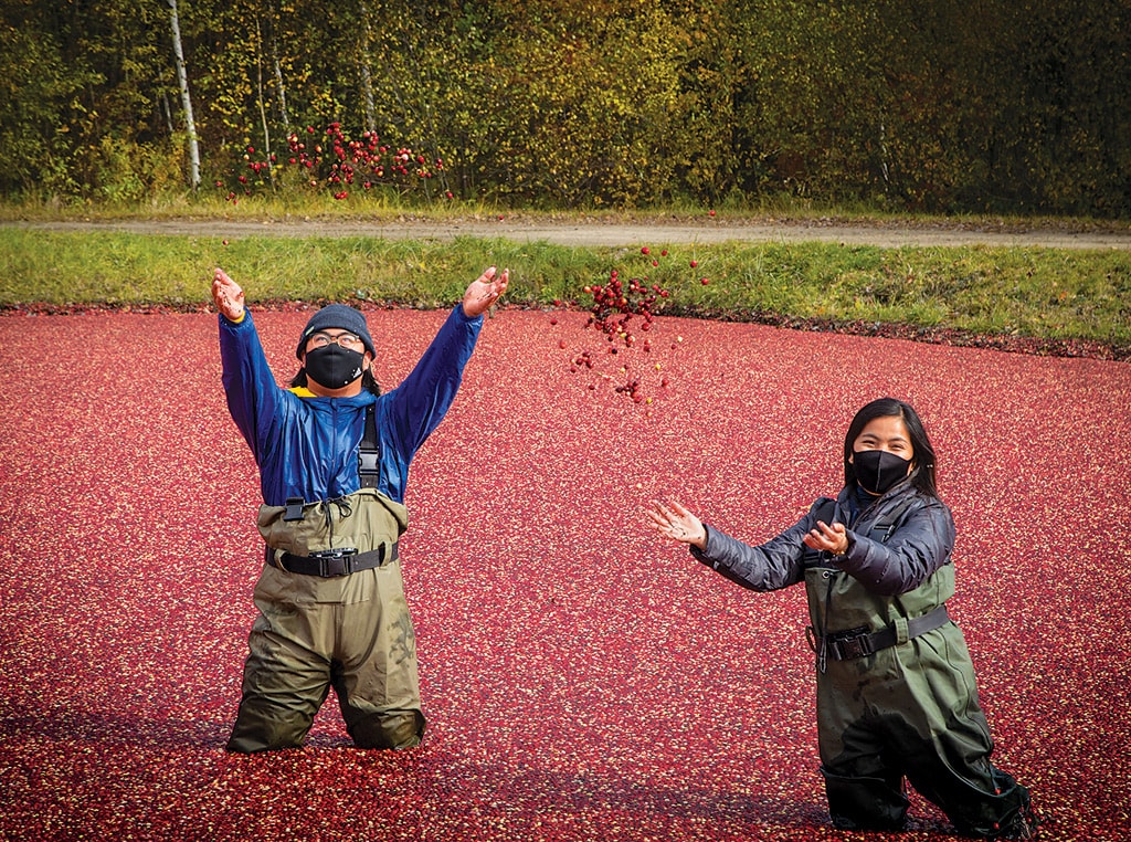
Agriculture, Ag Tech March 01, 2021
Ag Data Is Beautiful
Digital satellite data paints farm masterpieces.
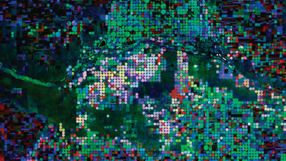
Let’s get one thing straight before we begin this story. The image on this page is not a Chagall. We can understand how you might think it is, because so many Corn Belt kids have made that bus trip to the Windy City to visit the Art Institute of Chicago, and this image could be just another panel in that monumental America Windows exhibit featuring the work of Marc Chagall, the Russian-born abstract artist, a stained-glass master.
Nor is it the work of Piet Mondrian, the Dutch superstar of Modern Art, although this image has all the hallmarks of De Stijl—The Style—which was Mondrian’s large-scale vision for art and architecture made up of in tersecting geometric blocks of color. Some of the images on the following pages are so similar to Mondrian’s 1919 composition called “Checkerboard, Dark Colors,” that one could assume that, if not by Mondrian, then surely these works must be from the brush of a protégé.
But no, the images in this story are compositions by Cormier, Sulla-Menashe, or Potere; not exactly household names. In fact, they are not artists at all, but scientists. They study data, pixels collected by satellite to form images of the farmland below.
The artist behind these images? Well, the artist is you. You and your fellow farmers around the globe, that is, who paint the brush strokes by choosing what crops to grow, where to grow them, and how (or if) they are irrigated. The entire globe is a canvas, and agriculture produces a masterpiece each year that can hold its own with the Old Masters of the art world.
-
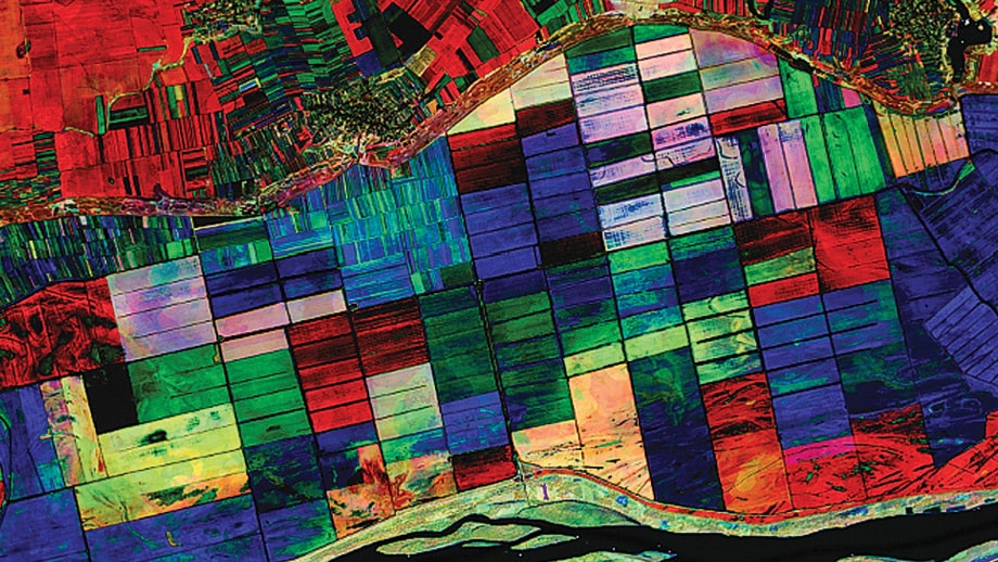
North shore of Danube River in Romania
-
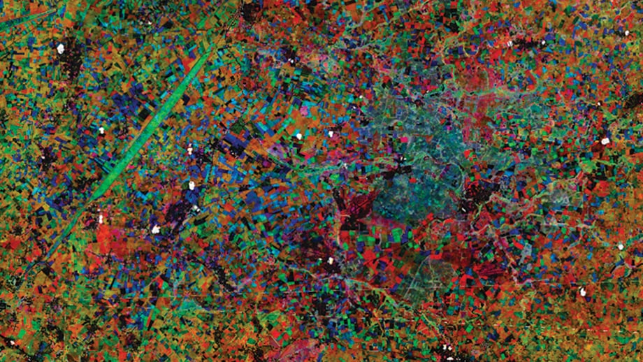
Study in contrast along the Turkey-Greece border.
-
Wheat and soy fields along India’s Narmada River
-
Tapestry of farming in southwest England
-
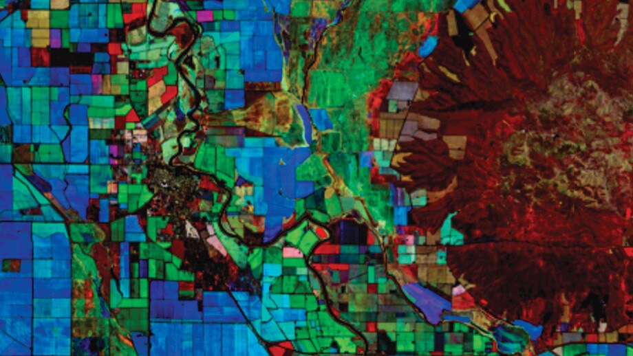
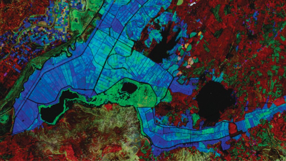
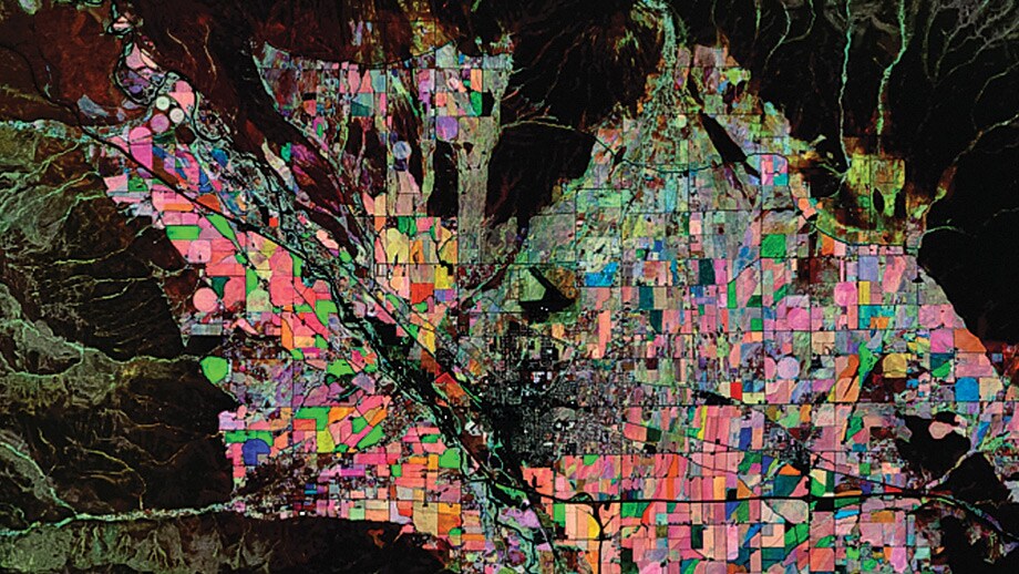
Sutter Buttes surrounded by Sacramento Valley fields
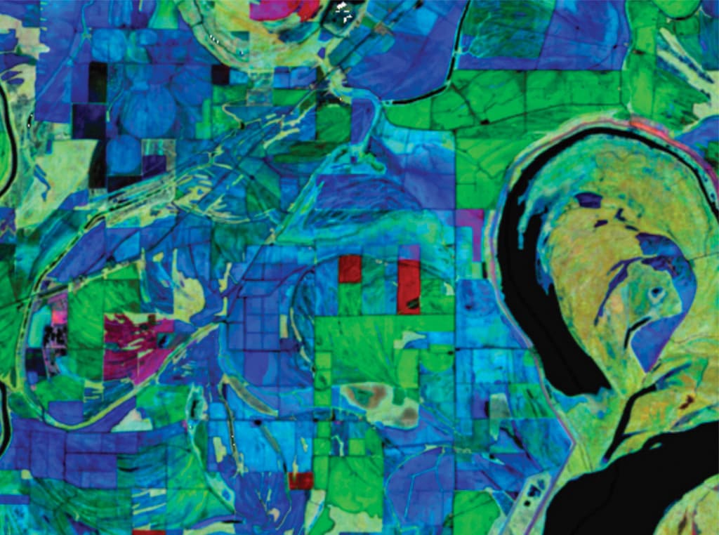
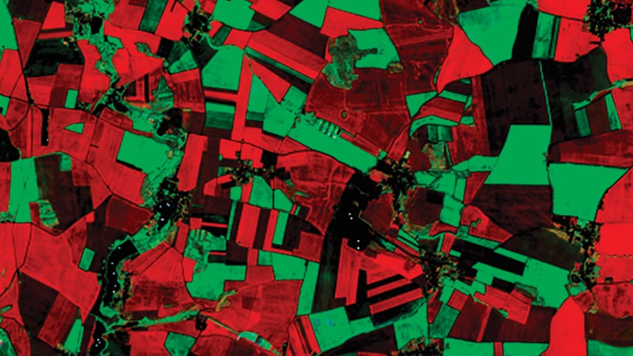
Abstract agriculture. That image on the opening page is more than a work of art; it is “working art.” It is a satellite image showing the fertile soils of the Mississippi River, with rectangles of cotton, soybean, corn, and rice fields in Lee County, Ark., and across the river in Tunica County, Miss. This image, and the others on these pages, are images posted by Indigo Ag to an Instagram project #FarmDataIsBeautiful.
“I’ve been passionate about satellite imagery in part because of how beautiful it is,” says David Potere. “Part of my fascination is just how beautiful the earth looks from space.”
Potere co-founded a startup company called TellusLabs, with a mission to produce a living map of the world’s food supply—a Google Maps approach to providing a digital representation of the calories available to mankind. TellusLabs was acquired by Indigo Agriculture in 2018.
The mission of mapping the food supply continues as Potere leads Indigo’s GeoInnovation team, which also works to identify opportunities to boost sustainability and open up new profit opportunities for farmers.
The roots of this story reach back to an art competition at Princeton University called Art of Science, in which researchers were asked to submit images produced in the course of research, or incorporating tools and concepts from science. “I was in graduate school at Princeton studying satellite remote sensing,” Potere says. “I entered the contest with a picture of center-pivot irrigation in Saudi Arabia called Desert Jewels. The contrast between the desert and the irrigated alfalfa was incredible.” The judges agreed, and selected the image as one of 56 works to appear in the 2006 Princeton Art of Science exhibition.
Potere continued to cultivate that link between art and science in his startup company. “I’ve always looked for ways that images can be the bridge to tell the story behind the science that we’re bringing to agriculture,” he says. As a tactic to spark excitement about the work at TellusLabs, the company came up with the idea of “Raster Friday.” This was an effort, headed by data scientist Tina Cormier, to post on Twitter the “coolest” image of the week.
Those cool images took another step forward in 2019, as software engineer Damien Sulla-Menashe published a new data layer in his work with Indigo, part of an effort to identify crop boundaries and to help in modeling farm management practices. This imagery feed is part of the Indigo Atlas technology, the flagship platform of the company’s GeoInnovation team.
Time machine. What makes these images so compelling is the temporal dimension. “This Enhanced Vegetation Index (EVI) image is comprised of multiple data layers stacked over time,” says Sulla-Menashe. “The input images were acquired throughout the 2018 growing season by the European Space Agency’s twin Sentinel-2 satellites, which image the earth every four days.”
In these images, red indicates early season crops, such as winter wheat; green indicates mid-season crops, such as corn; blue indicates late season crops, such as soybeans, as well as many fruits and vegetables.
“Varying combinations and intensities of colors may also indicate differences in plant timing or crop performance,” he continues. “Natural vegetation frequently appears as a light gray or tan, since these non-crops are imaged at a consistent maturity across all three time periods.”
Potere points out that, although these images are striking, they are more than eye candy. The advanced layering techniques help in a number of practical ways. Indigo uses these imagery views through time to pick up on patterns in the timing of crop health; those differences are key to mark the boundary between fields and management zones within fields. “We track millions of these fields every day using this technology,” Potere adds.
Indigo also uses the approach to help document carbon sequestration. “We use this imagery system as part of our core carbon technology,” Potere points out. “This is a system that pays farmers for sequestering CO2 via regenerative farming practices.”
Mapping regenerative practices is another use for this technology; Indigo has built the largest ever map showing regenerative practices such as cover cropping, low/no-till, and crop rotation. “This study is helping Indigo and our collaborators in academia better understand the resilience benefits of regenerative farming,” Potere adds.
Of course, Indigo also forecasts yields for major crops. “Our Atlas yield forecast relies on this technology for an accurate, in-season view of acres planted and a definitive map of corn and soy production,” Potere says. “When that is combined with daily satellite observations and weather data, we’re able to forecast end-of-season yield at national, state, and county levels ahead of the USDA predictions.”
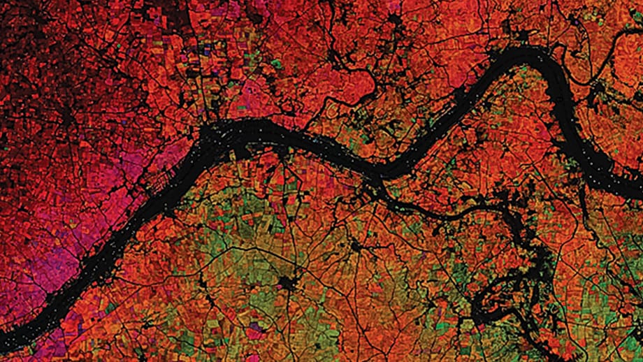
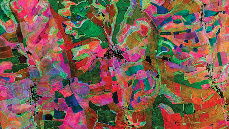
Beyond the practical, however, these images also are a study in geometry and geology, geography and geo-political boundaries. Images such as the tapestry in the upper right corner of this page shows an area north of London, one of the United Kingdom’s most fertile areas. Close scrutiny of the image shows old medieval patterns, with a radial network of fields centered on larger fortified villages and towns. “There also are traces of more ancient inhabitants,” Potere adds. “There are barrow mounds and other neolithic remnants.”
Both Potere and Sulla-Menashe completed a creative “100-day challenge” in which they shared some of these exotic scenes of farmland around the world. The QR code above will direct your mobile device to the Instagram images tagged under #FarmDataIsBeautiful. “We explored agriculture all around the globe, from Mexico to Eastern Europe, India, and beyond,” Potere says. “It’s easy to become an armchair traveler and study the agriculture in any part of the world.”
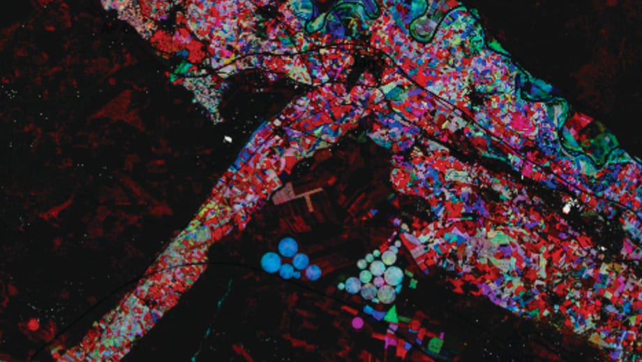
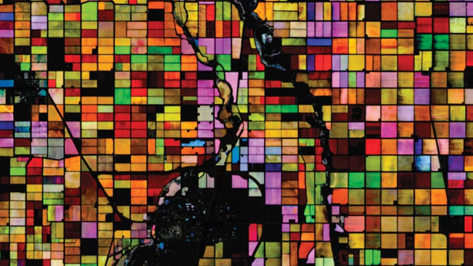
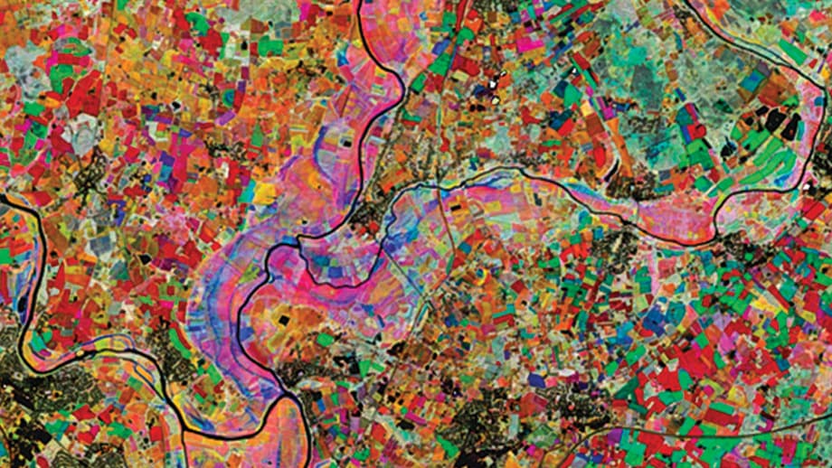
And that agriculture produces a unique look; the specialty crops of California’s Central Valley produce a multifaceted, jeweled image; a patchwork of fields on the Elbe River near Prague appear to be a work of Cubism; a study of the Turkey-Greece border results in a multi-hued work of bold blues and cyans.
Agriculture’s fingerprints are distributed around the world, and Potere points out that farmers make the most significant impact on the way the planet looks from high orbit. “Cities account for only 3% of the human-built environment, but farmers are the stewards of 40% of the planet,” he points out. “If an alien or bits this planet and is trying to figure out if it is inhabited or not, it’s agriculture that provides the clue that we are here.”
Those clues are the geometric shapes and patterns, curves and colors that fueled the creative theories put forth by the Dutch artist Mondrian. “In past times, when we lived in contact with nature, abstraction was easy,” he wrote. “It was done unconsciously. Now, in our denaturalized age, abstraction becomes an effort.”
It is somewhat ironic that the effort behind abstract agriculture is being driven by precision agriculture and its digital forces; the brush strokes behind the masterpieces seen here are simply the “zeroes and ones” captured by pixels on a sensor in space. Similarly, data from combines, sprayers, or planters can add layers of three-dimensional richness to a modern farm scene.
Farmers must be rooted in reality, but Mondrian, who was born in 1872, realized that reality sometimes is best illuminated by a ray of poetry. “I don’t want pictures,” he once wrote. “I want to find things out.”
Read More

Agriculture, Livestock/Poultry
Pandemic Fighters
These ag scientists are on guard against the next plague.
Agriculture, Specialty/Niche
Year-round Tourism
Muskoka farm develops innovative ways to incorporate four-season tourism attractions.