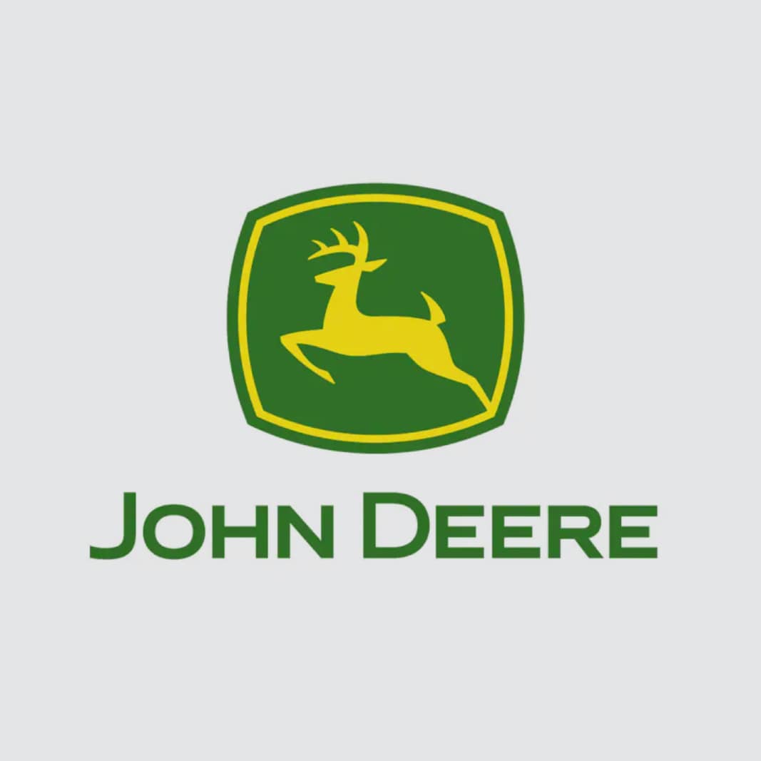
Our logo's seen a handful of changes throughout the decades, but it's always stood for the same thing: integrity, quality, humanity, commitment, and innovation.
The leaping deer
![]()
Our logo's seen a handful of changes throughout the decades, but it's always stood for the same thing: integrity, quality, humanity, commitment, and innovation.
1876
![]()
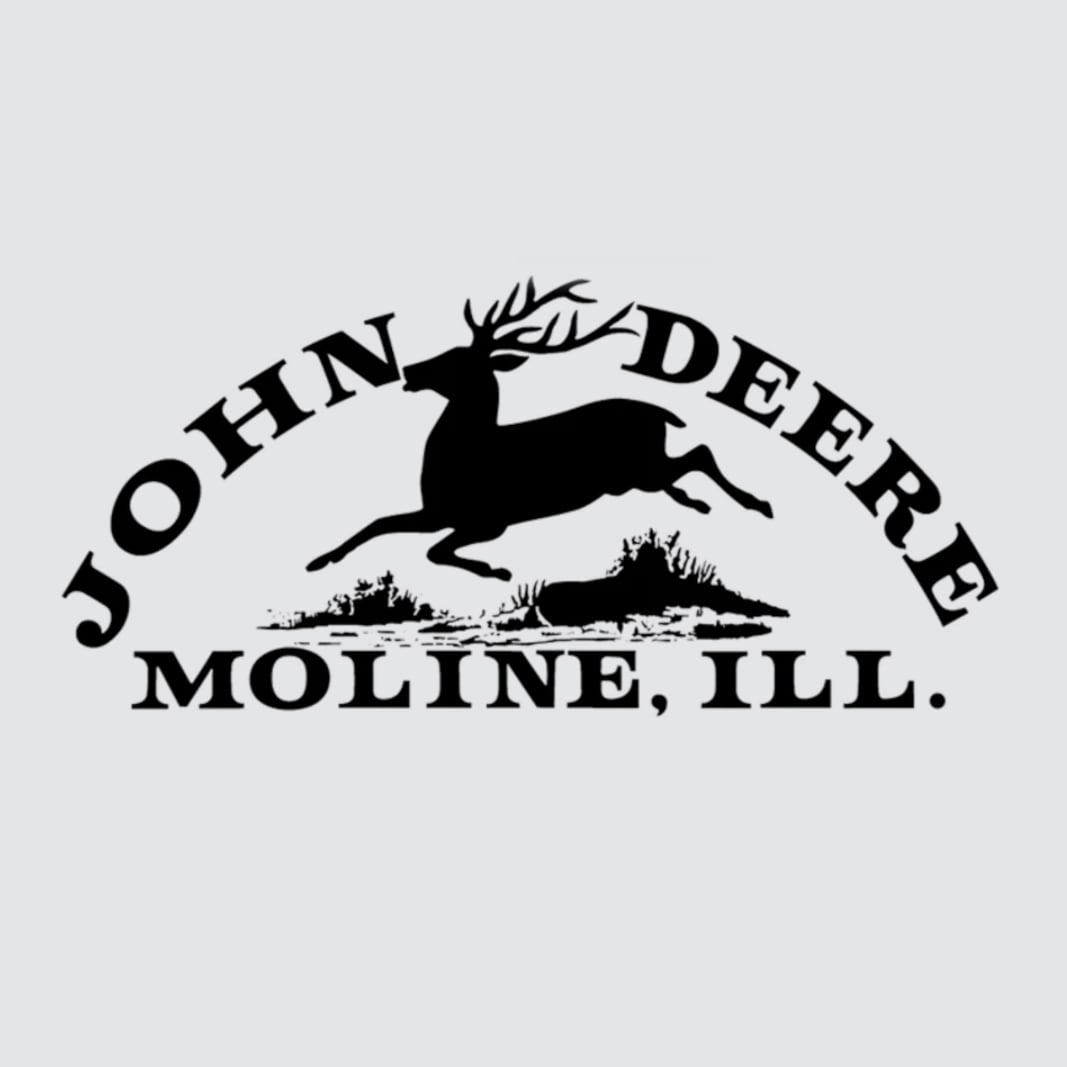
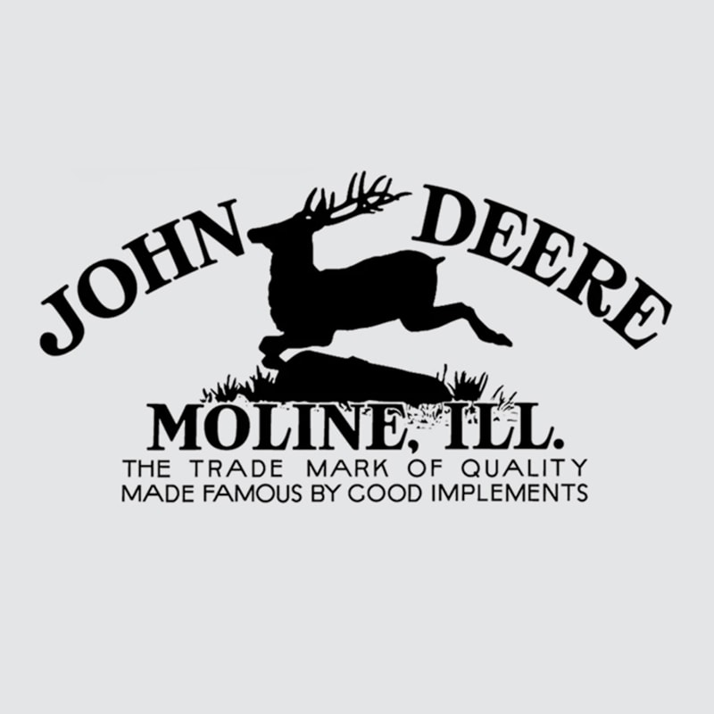
1876: Nearly 40 years of operation fly by before John Deere registers its first trademark. The logo itself had been in use since 1873, but the very real threat of fraud changed the unofficial logo into the first recognized symbol of agricultural excellence.
1912
![]()
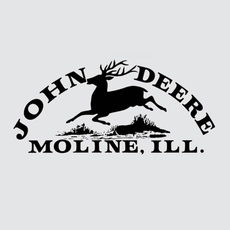
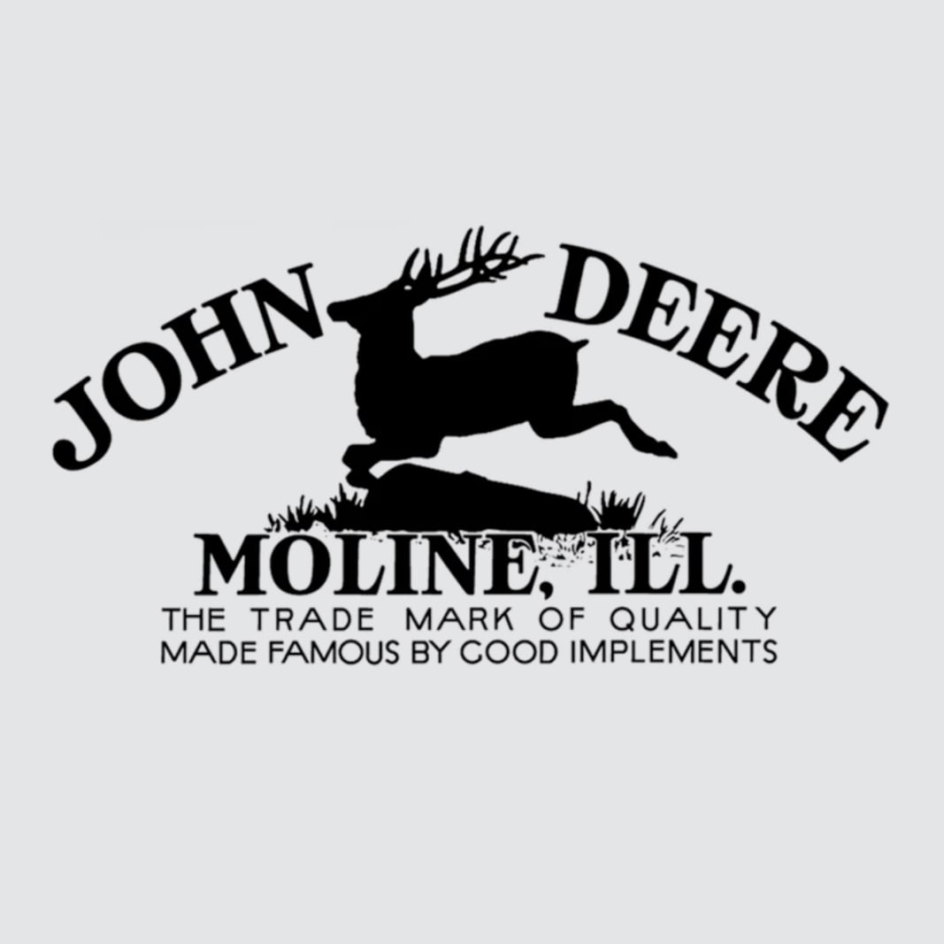
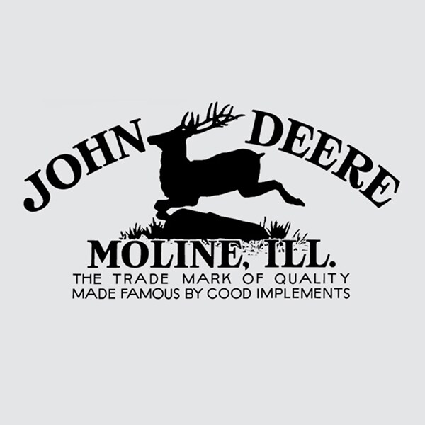
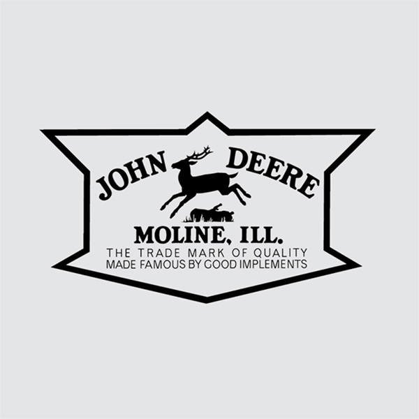
1912: The second version of the John Deere trademark was being used as of 1910 despite not being officially registered until 1912. A mindset that would become internalized about the brand is seen here for the first time: The Trade Mark of Quality Made Famous by Good Implements.
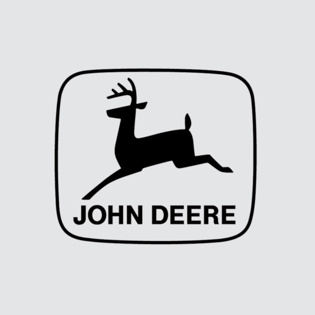
1936
![]()
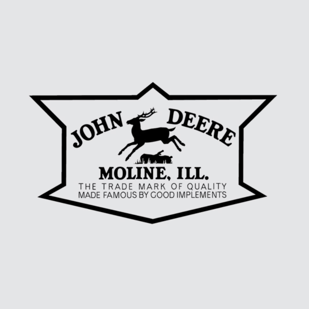
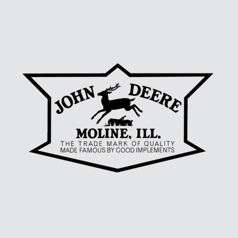
1936: As the John Deere profile became stronger and more recognizable, the classic deer in the logo followed suit. The smooth lines of the deer's silhouette made the trademark easier to stencil, and the 12-sided barrier became the only way in which John Deere was contained.
1937
![]()
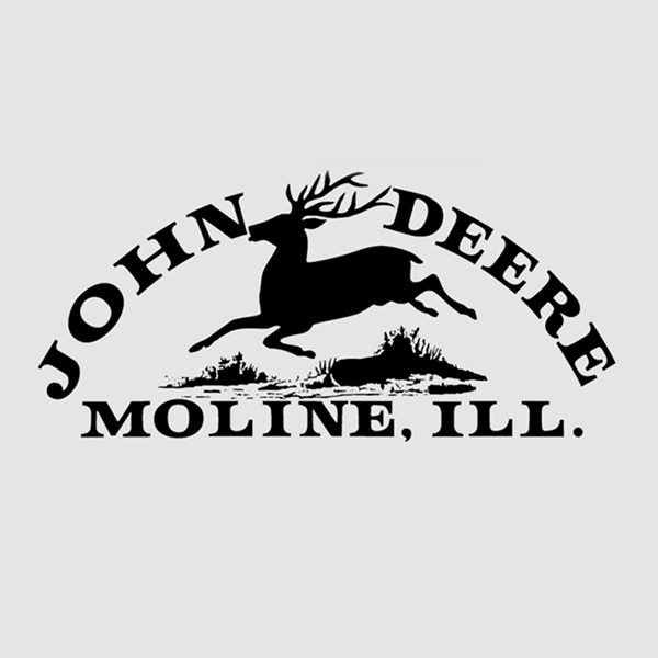
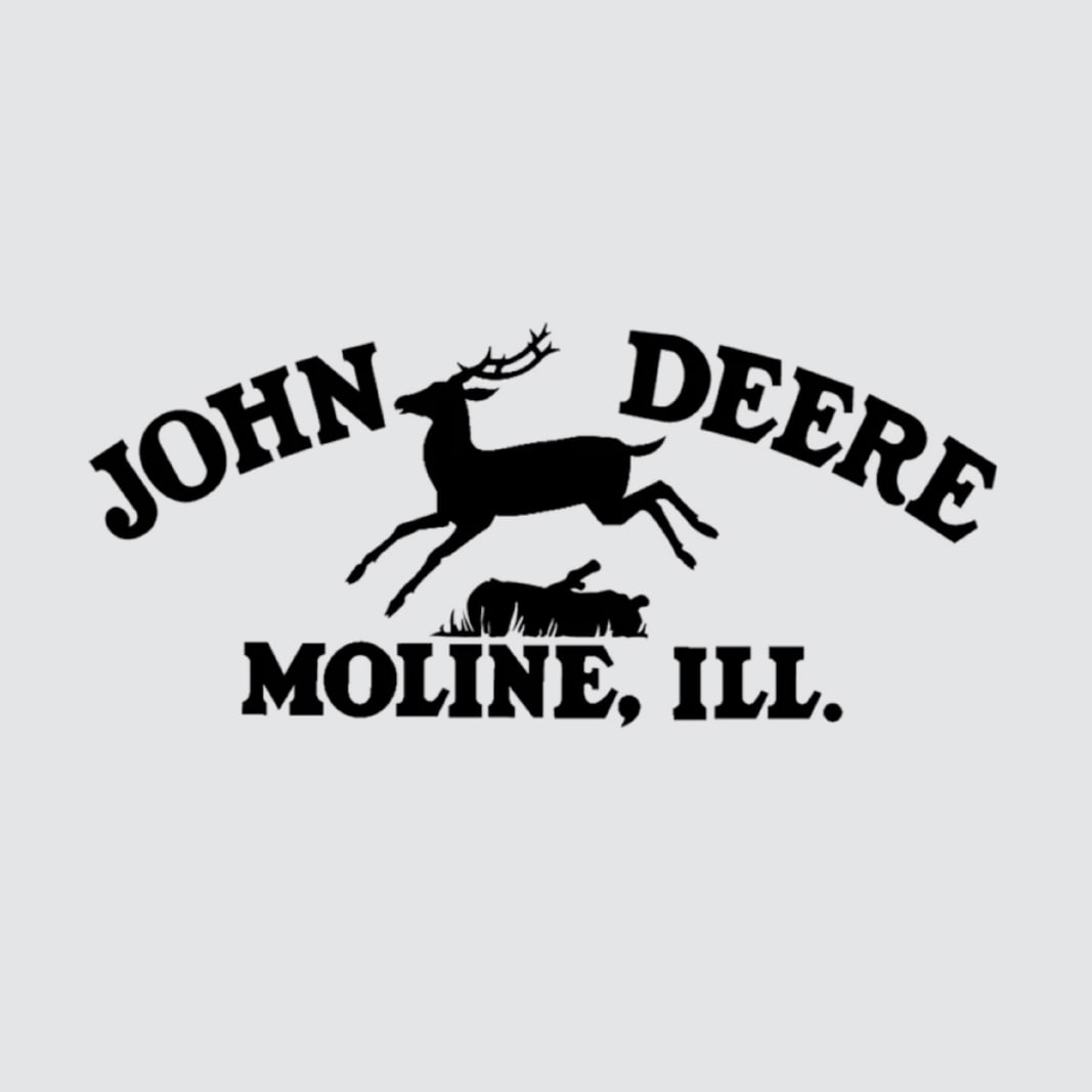
1937: John Deere celebrates 100 years of business and stripped down the logo to the basics. With just the name, the deer, and the city, the increasingly public trademark came to represent the simple depth of the John Deere product and service lines.

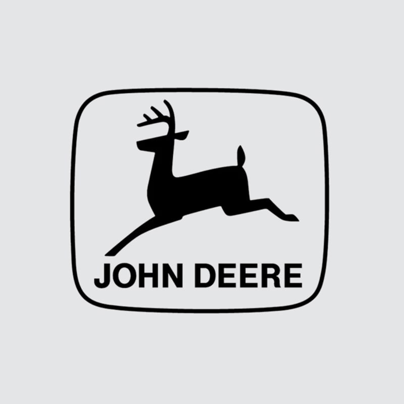
1950
![]()
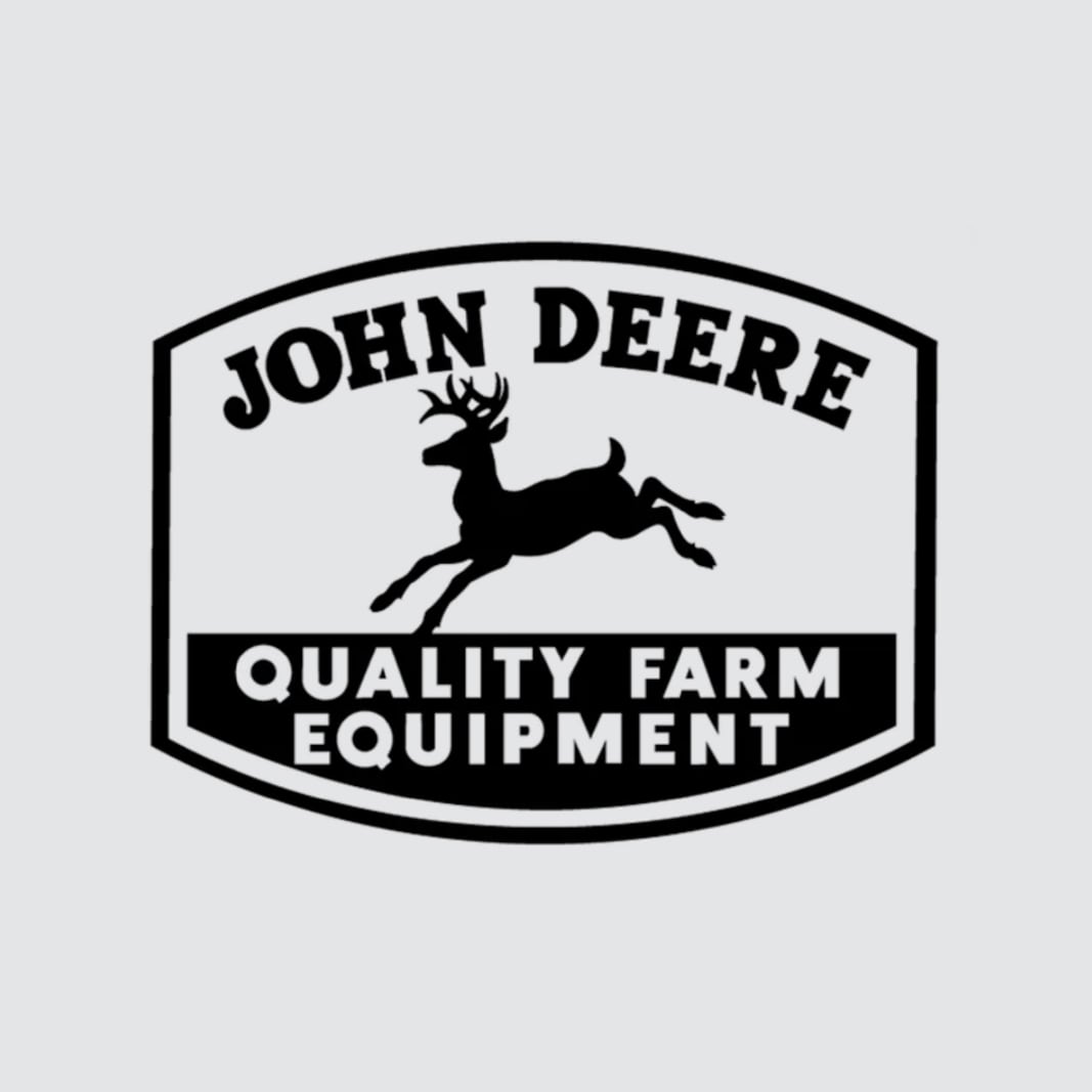
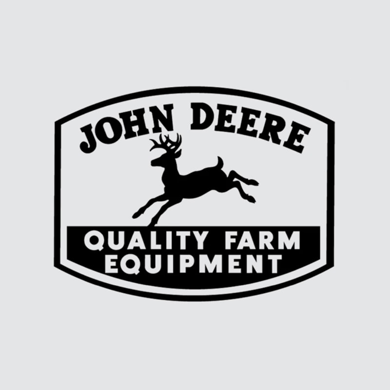
1950: Fortune favors the bold, and great fortune is exactly what John Deere was working towards when making the company name on the logo darker and thicker. "Quality Farm Equipment" became the slogan that said it all as the logo became enclosed once again, and the brand itself burst through to the world.
1956
![]()
1956: John Deere was becoming so established in the construction and forestry equipment industry that "Quality Farm Equipment" was a disservice as a slogan. The company let its name stand alone on the logo for the first time, a sign of extended industry reach worldwide.

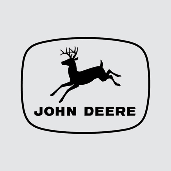
1968
![]()
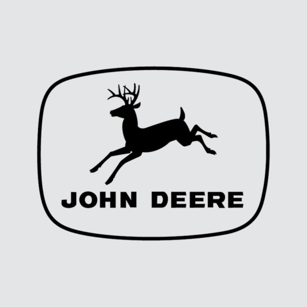
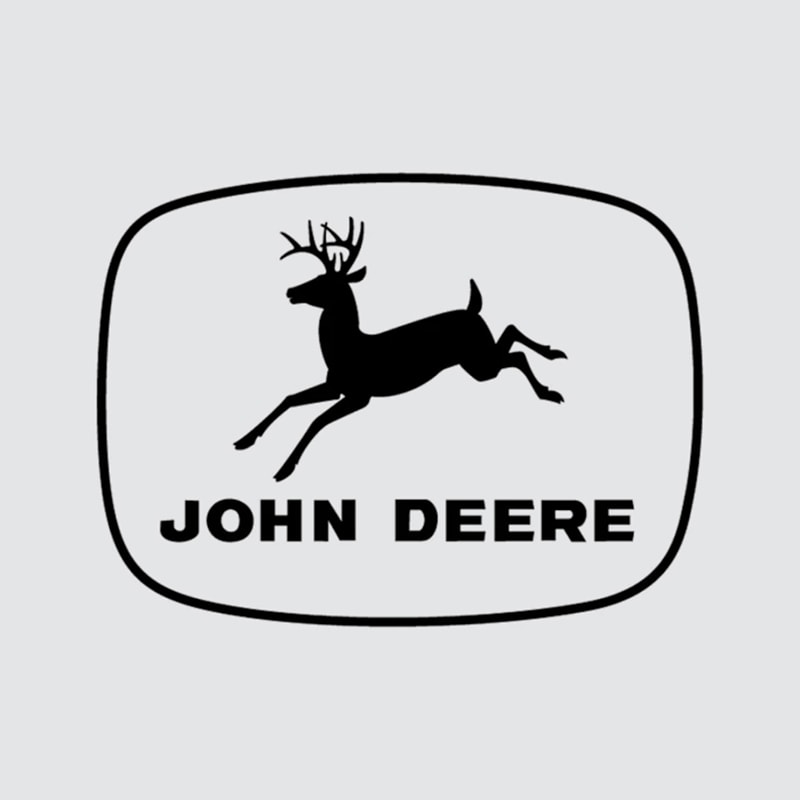
1968: Just as the revision 30 years prior simplified the logo for stenciling, the 1968 revision turned the deer itself into an easily drawn, straight-side silhouette. The width of the ellipse border was narrowed, and the size of the deer inside it was, much like the company it represented, growing ever larger.

2000
![]()
2000: Never one to leave good enough alone, John Deere changed its logo in a crucial way at the turn of the new millennium, showing its iconic "leaping deer" leaping instead of landing for the very first time. This current version illustrates a determination to advance through technology and to become the best version of what the world needs.